
I’ve often thought naming paint colors would be a great retirement path. (Well, one does need to start thinking of options when you’re this far into a design career!). I’ve always been a fan of all things paint, including the creative naming process. Recently, my cute sales rep for Sherwin-Williams, Rica Suhanec, sent me several new decks of new introductions collected in the Emerald Designer Edition. I was thrilled to get my hands on some new colors that are sure to become classics. There were so many ooooh’s and aaaah’s that I wanted to share a few of my favorites.

Let’s start with the names, of course! SW 9665 Sunny Side Up, SW 9689 Ripe Berry, and SW 9681 Rainsong are all from the Classic + Collected palette of soft shades and statement hues. Sherwin-Williams suggests you “make a colorful first impression with family heirlooms, furniture finds, and layers of collected charm” with these colors.

Sunny Side Up feels like a bold egg yolk (obviously!). While an entire room might be a bit bold for my eye, think of an accent door (inside or out!), a bold graphic stripe in a playroom, or a happy side chest in a mudroom.

Ripe Berry is a beautiful grayed-down eggplant. I can see a moody guest room or a fabulously deep, rich media room. The sheen you select can make a big difference as well. A matte finish would be truly stunning in this color.

Rainsong reads the most beautiful blue sky day without feeling like the nursery. Use this color for a peaceful master bedroom or even a chic living room.

The Rustic + Refined palette was created for the classic farmhouse look with a fresh, modern update. SO many beautiful colors here, but just to name a few: SW 9622 White Sail (pictured below), SW 9628 Winter Walk, SW 9629 Constellation, SW 9651 Sea Spray, SW 9650 Succulent (pictured below). Sherwin-Williams notes, “this palette offers hues of blue and green that are both airy and serene” and “perfect for pairing to create rooms of respite and retreat.”


There are definitely colors in this collection I will be planning design projects around soon. Soothing, calming and perfect for complimenting with some strong contrasting colors.

The Minimal + Modern palette speaks the language of perfect balance. Sherwin-Williams states these colors to be “carefully chosen and seriously styled, this perfectly proportioned palette of cool neutrals strikes just the right balance for a fresh, contemporary contrast.” Favorites for me from this collection are SW 9545 Ghosted, SW 9547 Vessel, SW 9554 Going Grey and SW 9565 Forged Steel. You’ll find non-boring whites, cool and warm grays, and deep neutrals with both gray and brown undertones, each one more beautiful than the next!

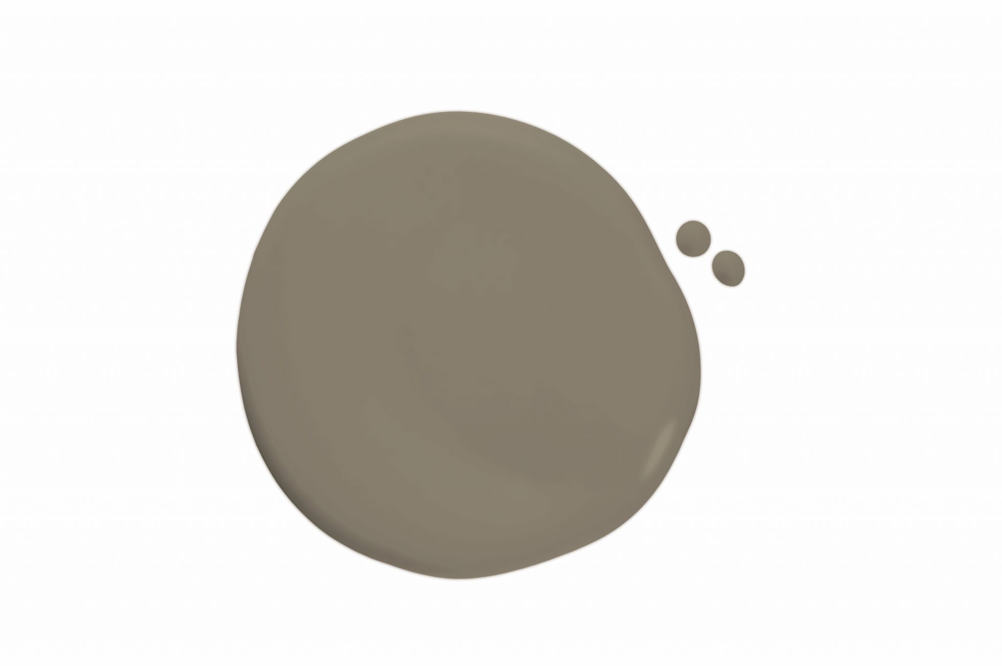
The Form + Function palette, in Sherwin-Williams’ words, is “completely pure, yet entirely statement making, these organic neutrals are ideal for setting the scene for an artful edit. Go ahead—layer eras, styles and global influences.” These colors are a nod to some of the many warm tones I used as many years ago as 15 years ago! SW 9540 Timber Beam, SW 9536 Lamb’s Wool, SW 9516 Accolade and SW 9501 Oak Milk are a few favorite picks … but wait! SW 9519 Country Tweed (pictured below) is also calling my name.
The last palette in the Emerald Designer Color Collection is Warm + Welcoming. Sherwin-Williams invites you to “make yourself at home with a palette of warm neutrals that effortlessly layer to create pulled-together personal spaces that feel cozy, comfortable, and oh-so inviting.” We could say your look would be “oh-so-Susan” here too!

There are three pages of neutrals, from light to dark, that could never be called average or forgettable. Look for my favorites: SW 9584 Mortar, SW 9586 White Sesame, SW 9589 Limewash, and SW 9595 Braintree. You’ll find the warm neutrals here to be both bold and beautiful. There’s sure to be some classic favorites to come from this collection in my next paint consultations!
At Black-eyed Susan, you’ll find us at the head of the fan club for Sherwin-Williams. From the support of a stylish, always ready, and cuter-than-ever sales rep (that’s you, Rica!) to the generous 8×10 paint memos we source for every client, we are ever ready to furnish you with the best tools for making selections when it comes to paint. Come see the magic with all we have to offer when it comes to shaking things up a little with these beautiful new colors.
Finding an entire collection of new paint colors to embrace in my designs is a pure and simple gift to me! I hope you’ll treasure these stylish new introductions as much as I do and become friends with a standby tagline, “paint is my magic wand.” I’m ready when you are for your next change. I’ll be waiting for your call!
xo,
Susan
